MEALS//SWEETS BY THE STARS
COOK BOOK design
Publisher Logo Design
The publisher logo is called Cherish Publications and in order to keep consistent with its theme, I used the font face that I designed called, “Cherish.” Then there is a slight play on words/visual with the word cherry and cherish. Since they sound familiar, I used the round terminals on the C to create the illusion of a cherry!
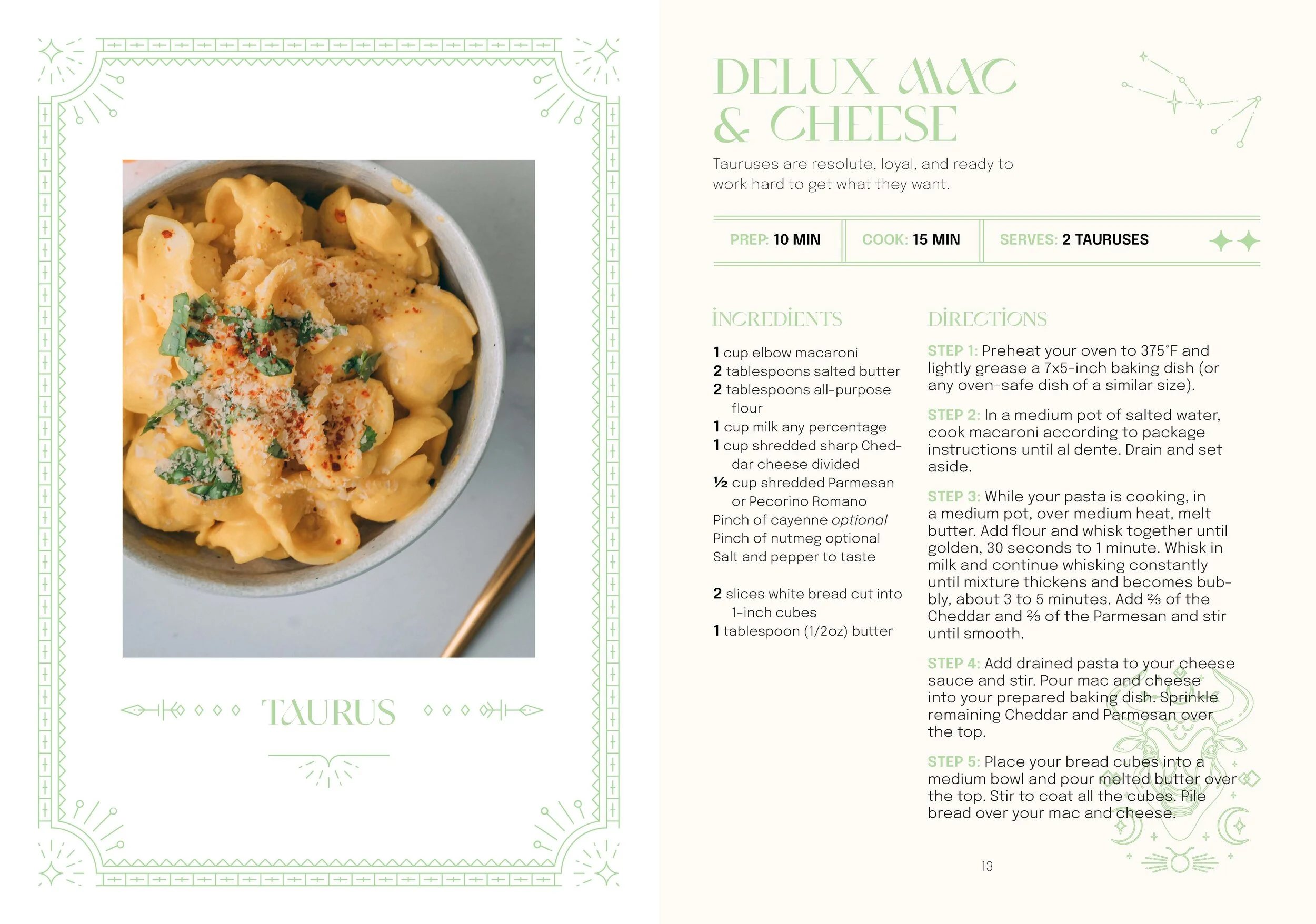
Cookbooks are one of the most popular publications that are being sold. This cookbook is catered to those with a keen eye for astrology.
The main goal of this project is to create a two series cookbook that demonstrates professional layout design knowledge by using character/paragraph styles and master pages.
Especially with cookbooks, it was crucial to take into consideration the layout since these are books that people will be reading while multi-tasking and cooking their meals. One of the important goals was to find that perfect balance between legibility and aesthetic.


