
BELGIAN WAFFLE RIDE
STYLE GUIDE + LOGO + REBRANDING


The Belgian Waffle Ride is one of the most unique races out there. A modern, irreverent 217 km race over dirt, gravel, single-track, steep bergs, long climbs, creek crossings, and unrelenting head-winds. Despite its deeply rooted history and uniqueness, it lacks social presence as an event. In an attempt to build their brand, this project will revamp their brand identity.
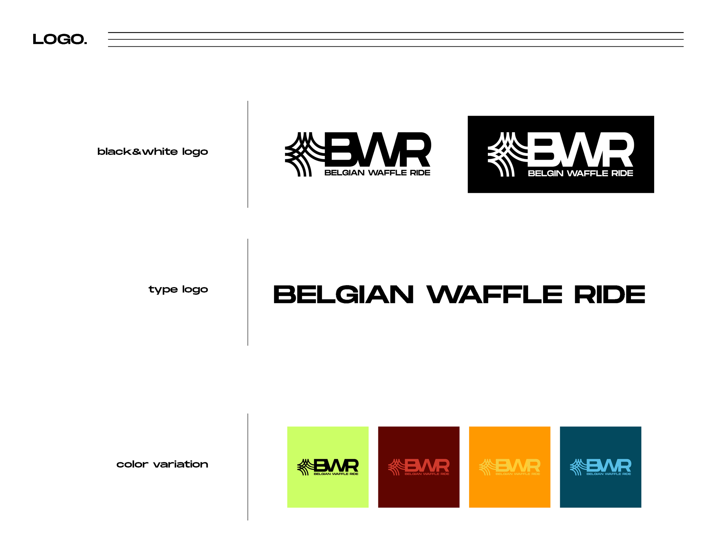
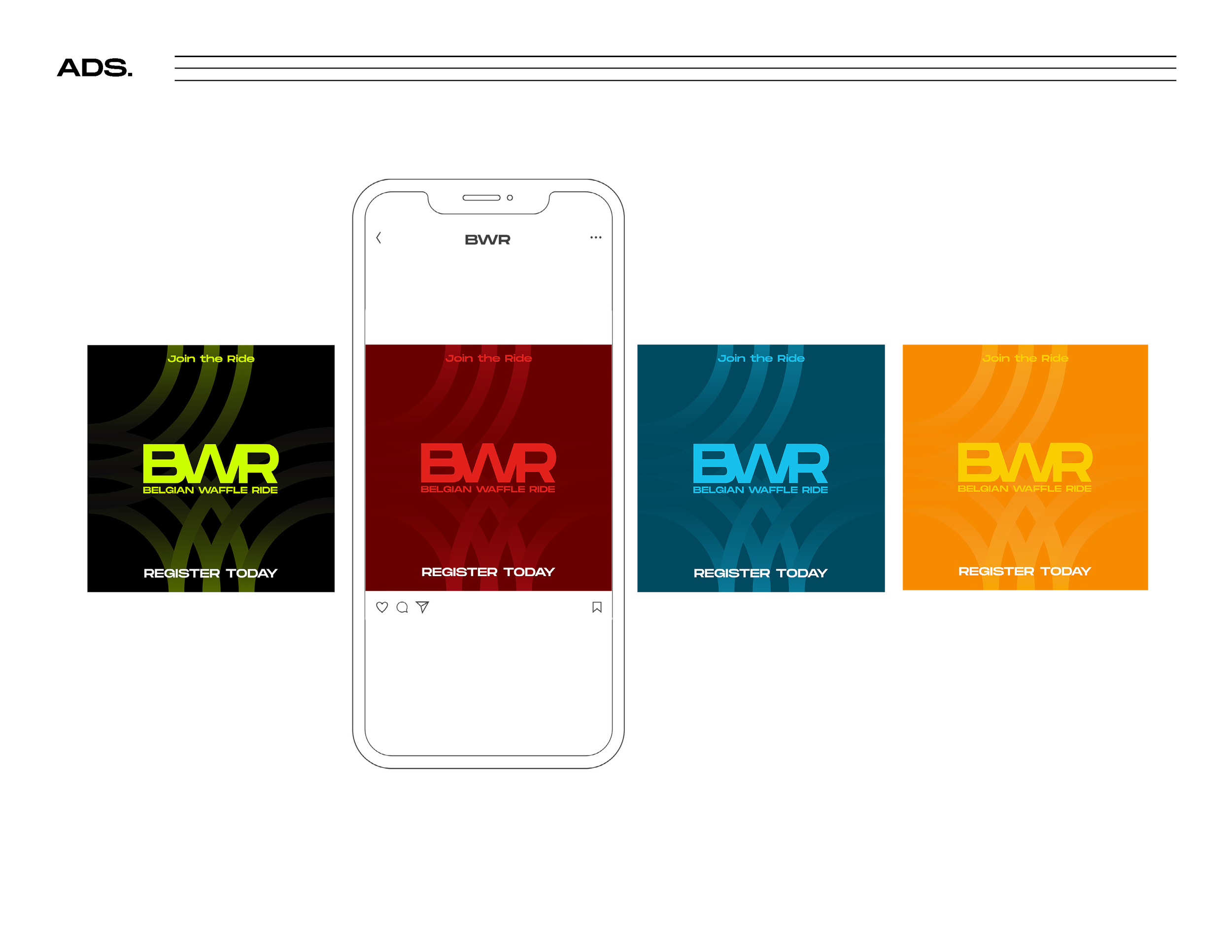
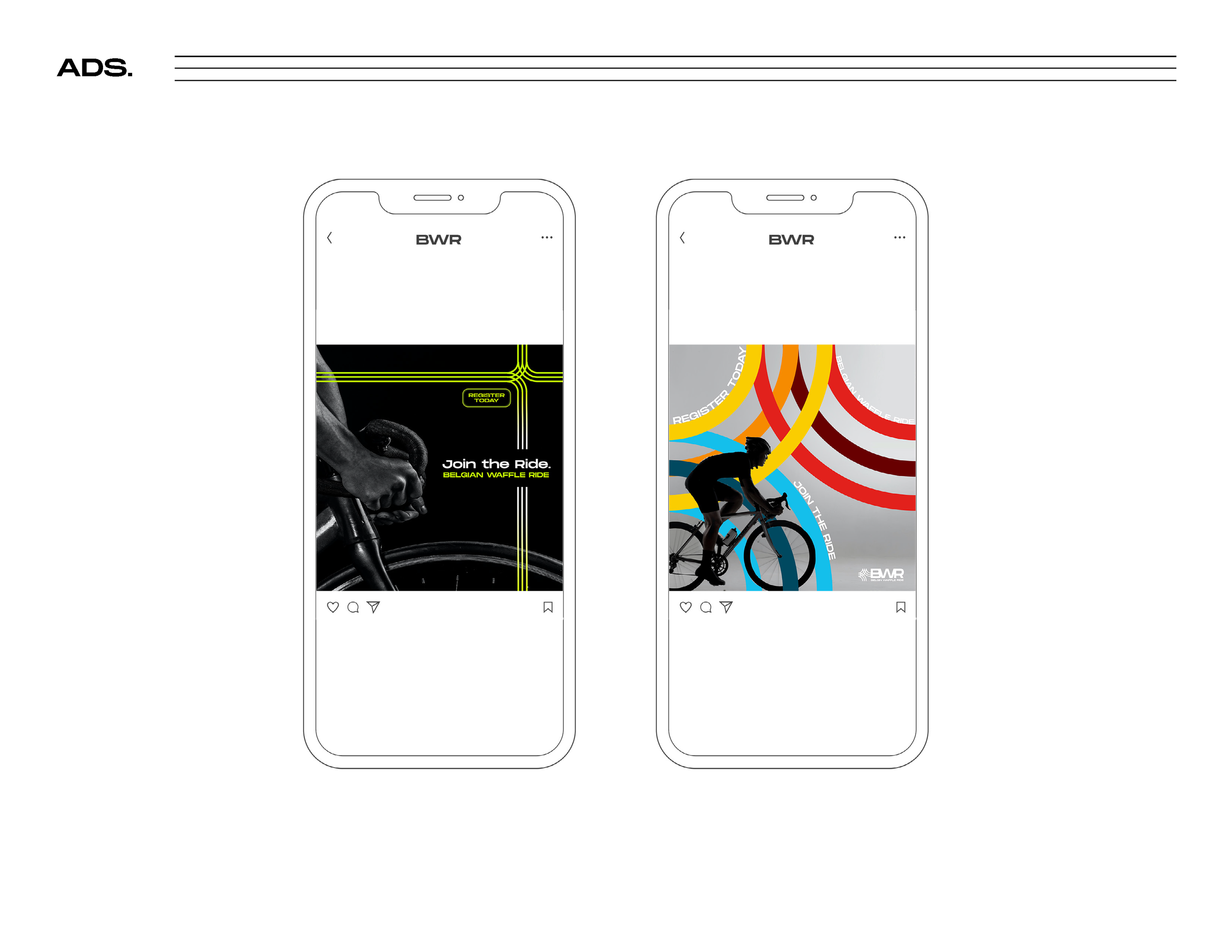
The main goal of this project is to create a strong new identity for this event that is consistent and intentional. The logo itself is a combination between typography and iconography. The type logo is a thick san serif font that is sporty and bold. The rings/circles in the iconography represents both the wheels from the bicycles but also all the different types of trails that make up the race. The social media advertisements are designed to create an ominous vibe so that it gets people more intrigued due to its lack of information.
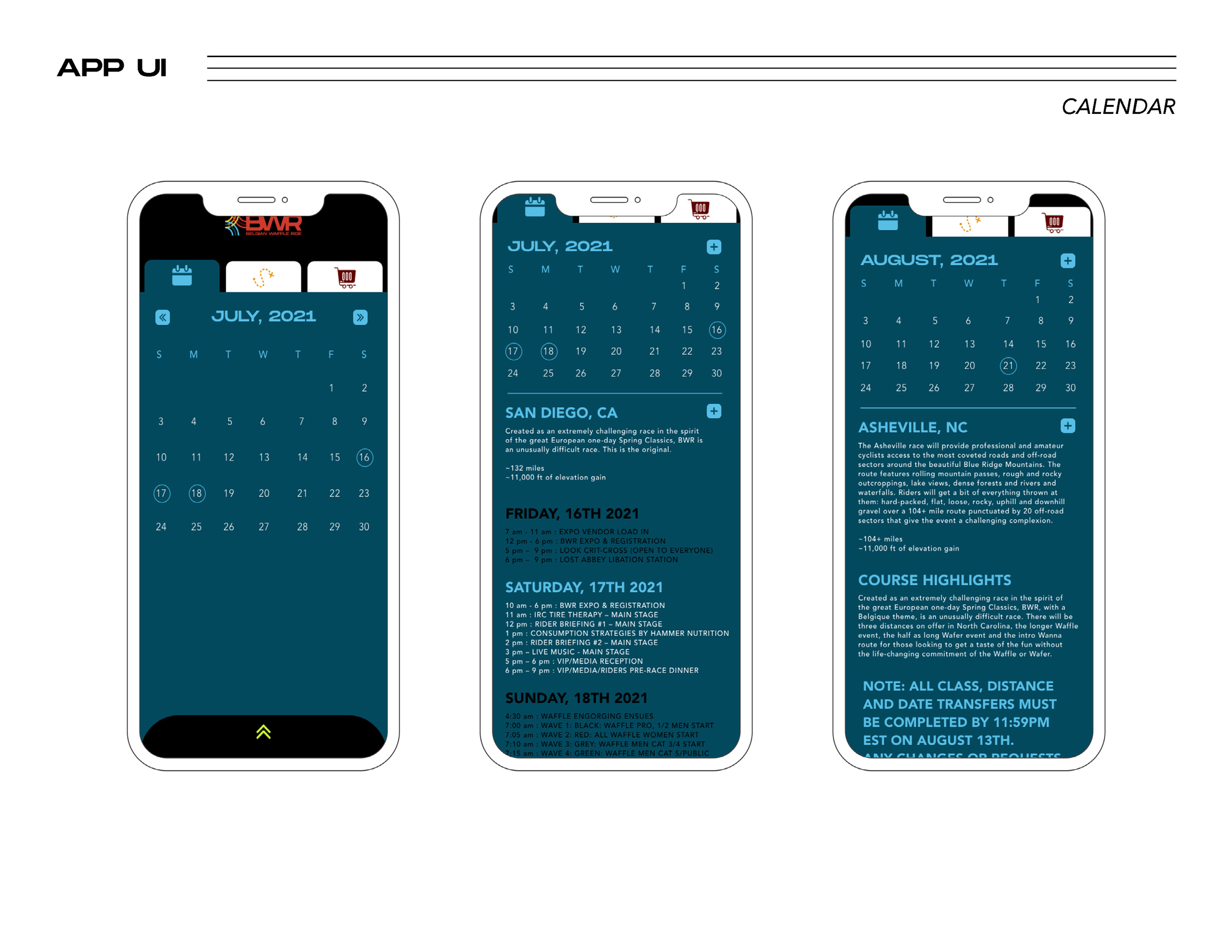
The new branded identity should be able to speak for the event itself and have strong visual elements that attracts even more participants
CLIENT: Student Project
DATE: 2021
SKILLS: style guides, branding design, ui/ux design
